A new Facebook header for WLGV and, with the physical entrance being so important, for any company, we made a few tweaks to the original, supplied photo (top).
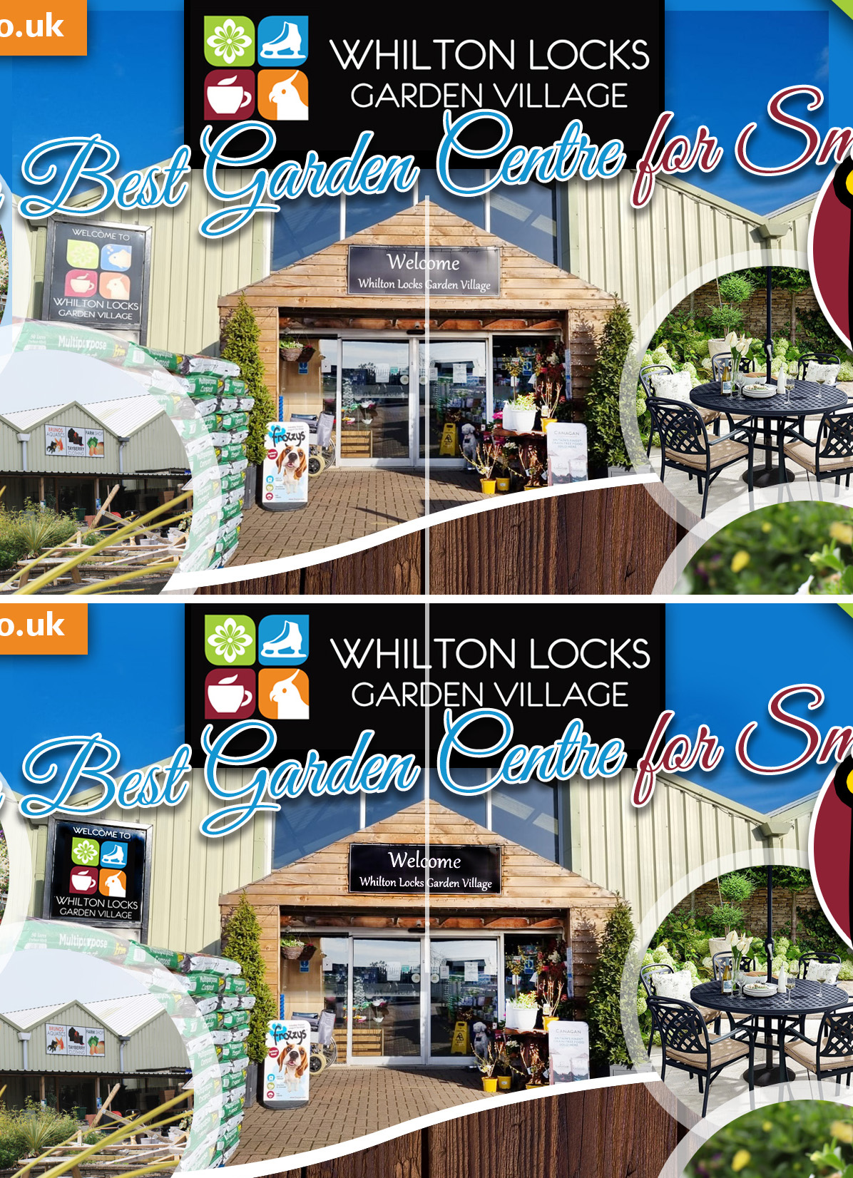
Firstly we ensured the main signage and welcome sign were better and ensured the blue sky matched the blue background. Just about ready to go and we thought how great it would be to have the apex of the building in the centre of the image – but then the doors were out. So, again, we tweaked them on system, moving them across to the right (to be centred – with the centre being shown with a line, we’ve added to illustrate – this line wasn’t on the final graphic) and the window bars above – let’s centre them too!
Finally a couple of strong shadows were removed from the foreground and the new panel was ready to go. Of course, the best thing, albeit with such an improvement to the original image – and thus such a better advertisement for the venue – nobody was aware of the changes!